
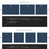
oday we’d like to share a simple animated grid layout with you. The responsive layout has a sidebar and grid items that animate to a larger content area when clicked. In the first demo the content area fills the grid and in the second demo, the whole layout moves to the left while the grid item is expanding.
Intence : A brand new way of Scrolling Indication

Intence is a new UX concept and a JavaScript library which reflects the scrolling state in a simple and intuitive manner. It highlights the scrollable area depending on the scrolling amount, thus efficiently explaining to a user what exactly can be scrolled, and is there much to scroll. Intence is suggested as a scrollbar replacament for a general designation of a scrollable area. The library is written in vanilla JavaScript and has no dependencies.

Mikado Grid Gallery for WordPress

Mikado is a WordPress image gallery based on random grids with a lot of features.
It’s responsive and images will adapt with a nice and smooth animation when the browser is resized. You just need to decide width (also percentage) and height and Mikado will create a random grid inside the rectangle.
Features:
- Fully responsive and fluid layout;
- Dynamic filters and filtering animations
- Size of the gallery, width and height. The width can be in percentage so it perfect for responsive sites;
- Margin between images;
- 5 Lightboxes;
- WordPress widget;
- Multiple galleries on same page;
- Great for mobile and tablets;


iFrame Resizer : jQuery plugin to Resizing iFrame to Content size

This library enables the automatic resizing of the height and width of both same and cross domain iFrames to fit the contained content. It provides a range of features to address the most common issues with using iFrames, these include:
- Height and width resizing of the iFrame to content size.
- Works with multiple and nested iFrames.
- Automatic domain authentication for cross domain iFrames.
- Provides a range of page size calculation methods to support complex CSS layouts.
- Detects changes to the DOM that can cause the page to resize using MutationObserver.
- Detects events that can cause the page to resize (Window Resize, CSS Animation and Transition, Device Orientation and Mouse events).
- Simplified messaging between iFrame and host page via postMessage.
