Best jQuery Responsive Plugins & Tutorials with Demo

    jQuery Vertical Responsive Menu

    jQuery Vertical Responsive Menu

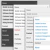
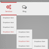
    Collection of Responsive Vertical Menus, with 20 color schemes, cross-browser support and easy integration. Responsive Vertical Menu can be used in sidebars of any site as well as admin dashboards.

    Features :

    • Responsive.
    • Cross-Browser.
    • 20 Color Schemes.
    • Animated.
    • Easy Integration.

    Responsive Nav : Responsive navigation plugin with JavaScript & CSS3

    Responsive Nav : Responsive navigation plugin with JavaScript & CSS3

    Responsive Nav is a tiny JavaScript plugin which weighs only 1.7 KB minified and Gzip’ed, and helps you to create a toggled navigation for small screens. It uses touch events and CSS3 transitions for the best possible performance. It also contains a “clever” workaround that makes it possible to transition from height: 0 to height: auto, which isn’t normally possible with CSS3 transitions.

    Horizontal Slide Out Menu with CSS3 & JavaScript

    Horizontal Slide Out Menu with CSS3 & JavaScript

    A horizontal slide out menu with a grid-like thumbnail layout for the submenu. With media query examples for smaller devices. The menu slides out from the top when a main menu item is clicked and the sub-items fade in. When clicking on another item, the height of the submenu will adjust and the content will fade in and out while switching.

    Some media query examples show how to make the menu responsive and change the view to a touch-friendly vertically stacked navigation.

    CSS3 Product Grid Layout with JavaScript

    CSS3 Product Grid Layout with JavaScript

    A responsive product grid layout that comes with some UI details for inspiration. The product will rotate showing the backside of the item when the rotate button is clicked. Some examples of how tooltips can appear on hover or click are also included. Media queries can be used to resize the items in the grid or change the number of items in a row. Flexbox is used when supported.

    Responsive Retina-Ready Menu with CSS3 & JavaScript

    Responsive Retina-Ready Menu with CSS3 & JavaScript

    Today we will create a colorful Retina-ready and responsive menu inspired by the colors of the Maliwan manufacturer of the Borderlands game. The menu automatically changes to one of three different layouts depending on the browser window size: a “desktop” inline version, a two columns tablet-optimized version and a mobile version with a menu link to display and hide the navigation for smaller screens. To make the menu fully retina-ready, we will use an icon font so that the icons of the menu won’t get pixelized on resize.

    Blocks – jQuery CSS3 Responsive Menu

    Blocks - jQuery CSS3 Responsive Menu

    “Blocks – Responsive Menu” is navigation component based in jQuery and CSS. It is a responsive menu component and can be used in various website types.

    Features:

    • 8 Styles
    • Javascript/CSS3 effects
    • Icon Support
    • Collapsible
    • Cross Browser
    • Easy to use
    • Easy to customize

    Morphing Devices : Slideshow for showcasing Responsive web design

    Morphing Devices : Slideshow for showcasing Responsive web design

    Today we want to share an experimental “morphing” slideshow with you. The idea is to transition between different devices that show a screenshot of a responsive website or app by applying a “device class”. By using the same elements and pseudo-elements for all the devices, we can create an interesting morph effect. We will control the classes and the switching of the image with some JavaScript. We’ve also added an option for autoplaying the slideshow and for rotating some of the devices.

    Rubberband : jQuery plugin for adding responsive breakpoint events

    Rubberband : jQuery plugin for adding responsive breakpoint events

    Rubberband is a jQuery plugin for adding responsive breakpoint events. Sometimes you need to know when a responsive page changes. Rubberband allows scripts to act on media query changes in real time by making use of the browser’s internal media query matching system, window.matchMedia.

    FlexNav : jQuery Plugin for Responsive Menus

    FlexNav : jQuery Plugin for Responsive Menus

    FlexNav is a mobile-first example of using media queries and jQuery to make a decent site menu with drop downs. Special attention is paid to touch screens using touch events and tap targets. This is something I use to test different navigation techniques and may change as I iterate over different solutions to the problem. Basically I want a simple model to build upon when working on sites from scratch.

    Features:

    • Multiple nested sub menus
    • Tap targets to reveal sub menus for touch screens
    • Hover reveal for desktop
    • Keyboard tab input accessibility
    • Fallback for no JavaScript
    • Fast clicks for touch screens (no 300ms delay)
    • Use class .one-page on the body, .menu-button, and ul.flexnav for single page fixed menu


    Responsive_DG_Slider : Responsive jQuery Banner Slider

    Responsive_DG_Slider : Responsive jQuery Banner Slider

    I am showing It’s Pagination circles with the height relative to the width functionality powered by the fantastic java-script library jQuery.