
A layout switch with two viewing modes: grid and list. The layout is defined by a view class that gets applied to the main wrapper. Some example media queries show how to make things responsive.
Best jQuery Responsive Plugins & Tutorials with Demo
Dasky : jQuery Timeline Slider
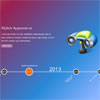
Dasky is a jQuery timeline slider,you can use it to show you products’s chagelog/loadmark, or loadmark of you team/life. And others what you want. It based on the power of css transforms and will fallback in old browsers who do not support it.
Features:
- Fluid layout
- Fullscreen or not
- Auto play
- Mousewheel control
- Keybords control
- Major browsers compatible and fallback to old browsers
Flexy Menu : jQuery Responsive Horizontal & Vertical Menu with CSS3

Flexy is a menu component based in CSS and Javascript code. You can use Flex Menu it as a horizontal or vertical menu. It is a responsive and collapsible menu, suitable for any type of website.
Features:
- Responsive layout
- Horizontal and Vertical
- 8 Styles
- Javascript/CSS effects
- Collapsible
- Major browsers compatible
Mason : Creating a perfect grid with jQuery
Mason.js is a jQuery plugin that allows you to create a perfect grid of elements.Mason was created to solve a problem with most grid system currently available. Gaps. When using Masonry, Isotope or any of the other grid plugins out there sometimes your grid will contain gaps or ragged edges. Mason was made to fill those gaps in.
Built on the idea of true masonry when a grid is constructed there are bound to be holes, so Mason calculates where those holes are fills them in.
jQuery Horizontal Gridfolio Pro

Horizontal Gridfolio Pro is a fully responsive media grid plugin that allows you to display media content with an unique and original layout. It’s perfect for presentations, for anyone that want to obtain a great impact on their visitors.
Horizontal Gridfolio Pro features a large variety of options, it can have any number of categories and each category can have any number of images. When a thumbnail is pressed you can choose either to display an original media lightbox which we have coded, no action or open a webpage. The lightbox can display images, iframe (html pages) and videos loaded from YouTube or Vimeo.
Features:
- Responsive / Flexible / Fluid layout: the grid can be used with three display types, responsive/fixed, fluid width or fullscreen.
- Autoscale: The grid can resize it’s height proportional to the width this way on smaller screens it will keep a correct ratio and it will be completely visible (optional).
- Drag or Scroll Function: The grid can be dragged with the mouse/finger or scrolled like a regular HTML page.
- Mouse wheel support: The grid can be scrolled with the mouse wheel (optional).
CollagePlus : jQuery image gallery plugin

This plugin for jQuery will arrange your images to fit exactly within a container. You can define the padding between images, give the images css borders and define a target row height.
CollagePlus relies on all images being loaded before it can calculate the layout. It does not run off image sizes specified in the DOM. If you have image sizes available in the DOM then you’re probably better off calculating the layout server-side (assuming that’s where you got the image sizes from) and writing the result directly to the HTML template you’re generating.
Universal Responsive Mega Menu with jQuery & CSS3

In this a author put together a flexible mega menu system that can hold 12 sizes of drop downs, unlimited fly-out elements combined with a jQuery script to enhance the whole system.It can be used as a sticky footer (with mega “drop-ups”) using the exact same markup as the “standard” mega menu. You can switch between those 2 variants just by changing a single class.
Features:
- Header and Footer Mega Menus
- Fully Responsive Menu
- Retina Ready Graphics
- Flexible 12-Columns Grid
- Styled Typography and Elements
- Simple Working Contact Form
- Clean and Professional Design
- Touch-Screen Devices Friendly
- Cross-Browser Support
SmartMenus : jQuery Advance website menu scripts

SmartMenus jQuery is a successor to one of the oldest website menu scripts which was released back on August 2, 2001. Although the name of the project remains the same, the jQuery plugin is a completely new open-source script designed and developed from scratch. It’s main goal was to create a script that supports equally well widest possible variety of browsers running on all kinds of platforms and devices – desktop computers, tablets, mobile phones.
Features:
- Optimized for mobile and desktop browsers supporting touch, mouse or both inputs at the same time
- Section 508 compliant and fully accessible to assistive technology like screen readers
- List-based (search engine friendly) markup – can be easily generated from any kind of database
- Completely CSS driven with fully customizable menu styles
- Unlimited menu trees on the same page and unlimited sub menu levels supported
- Horizontal or vertical main menu items arrangement
- Absolute/relative/fixed positioning for the main menus supported
- Right-to-left and bottom-to-top display of the sub menus is possible
- Full window size detection – the menus will always be kept inside the window’s boundaries
- Automatically adjustable width for the sub menus is possible (including min/max settings)
- Keyboard navigation friendly (Tab key)
jQuery Responsive Megamenu with CSS3

Responsive Megamenu is a menu component based in CSS and Javascript code. It can be used like a dropdown navigation, megamenu navigation or both. It’s has a responsive and fluid layout.
Features:
- 11 Styles
- Javascript/CSS3 effects
- Grid system
- Responsive layout
- Fluid layout
- Collapsible
- Major browsers compatible


