Best jQuery Responsive Plugins & Tutorials with Demo

    Mobify.js : Take control of your DOM for Responsive Sites

    Mobify.js : Take control of your DOM for Responsive Sites

    Mobify.js is an open source library for improving responsive sites by providing responsive images, JS/CSS optimization, Adaptive Templating and more.

    Mobify.js also provides a Capturing API for manipulating the DOM before any resources have loaded, giving developers the ability to enable the listed features above without changing any backend markup.

    Smoothslides : Lightweight and Responsive jQuery slideshow

    Smoothslides : Lightweight and Responsive jQuery slideshow

    A simple, lightweight, and responsive jQuery slideshow by Kevin Thornbloom that features Ken Burns type animations.

    Features:

    • Lightweight [3.5Kb]
    • Four Animation Types: Zoom In, Zoom Out, Pan Left, Pan Right
    • Easily add captions
    • CSS3 transitions for smoother effects
    • Responsive image sizes

    jQuery Logos Showcase Pro – Grid – Carousel – Perspective

    jQuery Logos Showcase Pro - Grid - Carousel - Perspective

    Logos Showcase Pro contains 4 versions: Grid, Carousel (one by one), Carousel (Group) and Perspective. The last 3 versions have 2 skins: black & white. It allows you to easily display on your website: logos, clients, partners, sponsors, brands, portfolio items… you name it.

    Features:

    • touch screen navigation support for mobile
    • responsive design – available parameter to disable responsive behaviour
    • tooltip – available parameter to activate/deactivate the tooltip.
    • border – you can set the border size and border color for active and inactive image.
    • grayscale – available parameter to activate/deactivate the grayscale.
    • auto-play – you can define the time (in seconds) until the auto scroll will take place. If you set it 0 the plugin will not auto play.
    • external url link parameter for each image
    • target parameter: _blank or _self
    • multiple js options from where you can customize the plugin.
    • you can insert multiple instances in the same page with the same skin or using a different skin.

    Galereya : Easily customizable jQuery gallery with a masonry layout

    Galereya : Easily customizable jQuery gallery with a masonry layout

    Responsive, easily customizable jquery gallery with a masonry layout. Almost all animation and effects are based on CSS features.Works on Chrome, Safari, Firefox, Opera(turned off some CSS animations), IE7+(Graceful degradation), Android browser, Chrome mobile, Firefox mobile, Safari on iOS and etc. Galereya effects and browser compatibility depends on your custom CSS styles a lot!

    jQuery Flat Event Calendar Responsive Timeline

    jQuery Flat Event Calendar Responsive Timeline

    It’s a responsive event calendar. It can also be used as a timeline. It’s suitable both for responsive and fixed layout. Its features :

    • Flat UI.
    • Supported by all major browsers.
    • Responsive design.
    • 5 layouts included.
    • Own layout can be customized.
    • Almost fully css customizable.
    • Metro and iOS7 inspired.

    brandsBox : Logos Slider jQuery Plugin

    brandsBox : Logos Slider jQuery Plugin

    Logos slider jQuery plugin.

    Features:

    • Responsive
    • Configurable Grid
    • Hardware, CSS3 Transitions
    • 6 Smooth Sliding Transitions
    • Animations Speed Control
    • Hover Effects
    • 6 Color Modes for Logos
    • Logos Opacity Control
    • Sliding Modes
    • XML / JS Items Management
    • Major Browsers Support

    MetNav 2 : Another jQuery Metro UI navigation menu

    MetNav 2 : Another jQuery Metro UI navigation menu

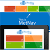
    MetNav 2 is jEffectBox’s 2nd jQuery navigation menu plugin based on Window 8 Metro theme. It’s very lightweight and looks good on almost all major browsers and devices. It’s a Windows 8 Tile base navigation menu which supports unlimited sub menus. It supports responsive design and works well on touch devices.This plugin is dedicated to all Metro lover in the world.

    Features:

    • Supports unlimited number of sub-menus.
    • Supports responsive design.
    • Looks good in almost all major browsers and devices.
    • Very easy to integrate to any website.
    • Full documentation included.
    • Very lightweight, only 3kb of JavaScript (minified version is 2kb).
    • Control appearance through CSS, so it can be restyled.
    • Supports touch devices.

    Storyline 3D Slider with jQuery & CSS3

    Storyline 3D Slider with jQuery & CSS3

    Storyline 3D Slider is a great plug-in for your template, which will make it have a stunning look. The S-3D-S will help you showcase your work in a splendid creative way. Your products has never been displayed so great!

    If you are a proud author or musician or super talented designer, blogger or photographer – the S-3D-S is just for you! It offers 19 colour schemes, 8 scroll effects, 6 slide styles, responsive design, infinite scroll & possibility to work smoothly on mobile devices. You can include your own html code and make your own styles to fit your site.

    Features:

    • 19 color schemes
    • 8 incredible scroll effects
    • 6 different post styles (blog, circle, image, audio, book, text)
    • 5 ways to navigate trough slides
    • Responsive design
    • Touch enabled
    • Infinity scroll
    • Lots of different post settings
    • Custom image roll over settings
    • CSS3 and JQuery powered effects
    7 Slider : jQuery Responsive Image Slider

    7 Slider : jQuery Responsive Image Slider

    7 Slider is one of the most complete image slider ever. It is built in latest jQuery and mobile compatible so anyone can easily use it without any restriction. And it is fully responsive and modern features like Video embed,Lightbox are supported which make it more stunning.

    Features:

    • 250+ wonderful animations(2d,3d) – Animations will come more as new version released.
    • Native browser support
    • Html5/Css3 transitions support – It uses html5/css3 transition for modern browsers.
    • Image Overall Loading – 7 Slider loads all images at once so that he/she doesn’t wait again while slides.
    • Image Preview support – 7 Slider provides image preview option on hover.
    • Customizable width and height – Width and height can be set.
    • Fully responsive – It’s fully responsive so it can be attached in touch device.
    • Full width functionality involved – Full width slider is available
    • Lightbox support – It supports lightbox based on users’ demand.
    • Touch device support – Touch events are supported.
    • Mouse swipe navigation support – Swipe functionality is available so users feel comfortable to navigate.
    • Video content support(Youtube,Vimeo) – Embeded videos are supported.

    intention.js : A library for intentionally dealing with responsive design

    intention.js : A library for intentionally dealing with responsive design

    Intention.js is a lightweight tool for responsive design developed at Dow Jones that manipulates the DOM via HTML attributes. The methods for manipulation are placed with the elements themselves, so flexible layouts don’t have to be so abstract and messy.

    What should an element’s classes be on mobile vs tablet? Where should advertising markup be placed when viewed on a desktop browser? Does the page require an alternate slideshow widget on touch-enabled devices? These are all scenarios that Intention.js can handle, altering the page based onusers’ devices. Context.js creates a set of common page contexts for width thresholds, touch devices, high-res displays and a fallback.