
Today we’d like to share some inspiration for simple stack effects with you. You have certainly seen these kind of effects, mostly used in image galleries, but also on single items on a page: one item is shown initially and then, with some trigger, more items are revealed, normally as decoration. One can imagine a couple of triggers for these effects: item hover, on load, on scroll and on click effects. When using some subtle, but creative moves, we can make some interesting effects that elevate a static design.
Best jQuery CSS2 / CSS3.0 Plugins & Tutorials with Demo
Hiding Overflowing Text Technique with jQuery & CSS
As web developers, we should build our sites so they accommodate variable lengths of text. You have to be sure that your markup looks just as good with a 50 character username as it does with a 5 character one. In the past, this was only possible by slicing text on the server side, or with JavaScript, but today we can do it only with CSS thanks to properties like max-width and text-overflow.

Creating a Border Animation Effect with SVG and CSS

Today we’d like to explore a very subtle, but interesting border animation effect that can be seen on the creative website of Carl Philipe Brenner. When you hover over one of the white portfolio items in the grid, you will see a subtle animation happening: the grid item becomes transparent and the border lines of each side animate clockwise, creating a really nice effect. In this case, the effect is done by animating the widths or heights of several spans with some JS. We’ll try a different approach that uses SVG and CSS transitions.
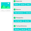
FH Mega Menu – jQuery Bootstrap 3 Mega Menu Plugin

The FH Mega Menu is a jQuery based Bootstrap 3.0+ mega menu plugin compatible with all mobile devices and modern web browsers.
Features:
- 100% Responsive Layout Design
- 100% Twitter Bootstrap 3.0+ Based
- Unlimited Color Schemes
- 3 Easy Step to Installation to any Web Projects
- Detailed Documentation for “How to”
- Flexible and 100% Bootstrap Columns Grid
- Font Awesome Icons Included
- Responsive Video and Google Map Integrated (Fitdivjs)

Slide Social Buttons with CSS3 Transitions
Slide Social Buttons are a fun way to display your social media buttons.These buttons are inspired by the Supersteil blog but instead of using jQuery for the animation, they use CSS transforms & transitions.
Features:
- Uses CSS transforms & transitions.
- Uses Icon Fonts, perfect for retina displays.
- Degrades gracefully for IE 8 – 9 & touch devices.
- It’s responsive!
Progress.js : A Themeable Progress Bar with JavaScript & CSS3

ProgressJs is a JavaScript and CSS3 library which help developers to create and manage progress bar for every objects on the page. You can design your own template for progress bar or customize it simply. You can use ProgressJs for show the progress of loading contents (Images, videos etc.) on the page to the users. It could be used on all elements including textbox, textarea or even whole body.


