Best jQuery Grid Plugins & Tutorials with Demo

    Shuffle : jQuery Categorize, sort, and filter a responsive grid of items

    Shuffle : jQuery Categorize, sort, and filter a responsive grid of items

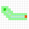
    jQuery Shuffle Plugin categorize, sort, and filter a responsive grid of items.

    Features:

    • Uses CSS Transitions!
    • Responsive
    • Filter items by groups
    • Items can have multiple groups
    • Sort elements
    • Advanced filtering method (like searching)

    Mason : Creating a perfect grid with jQuery

    Mason : Creating a perfect grid with jQuery

    Mason.js is a jQuery plugin that allows you to create a perfect grid of elements.Mason was created to solve a problem with most grid system currently available. Gaps. When using Masonry, Isotope or any of the other grid plugins out there sometimes your grid will contain gaps or ragged edges. Mason was made to fill those gaps in.

    Built on the idea of true masonry when a grid is constructed there are bound to be holes, so Mason calculates where those holes are fills them in.

    Gridly : jQuery plugin to enable drag and drop & resizing on a grid

    Gridly : jQuery plugin to enable drag and drop & resizing on a grid

    Gridly is a jQuery plugin to enable dragging and dropping as well as resizing on a grids. In the demo below try tapping or dragging any of the bricks.

    jQuery Horizontal Gridfolio Pro

    jQuery Horizontal Gridfolio Pro

    Horizontal Gridfolio Pro is a fully responsive media grid plugin that allows you to display media content with an unique and original layout. It’s perfect for presentations, for anyone that want to obtain a great impact on their visitors.

    Horizontal Gridfolio Pro features a large variety of options, it can have any number of categories and each category can have any number of images. When a thumbnail is pressed you can choose either to display an original media lightbox which we have coded, no action or open a webpage. The lightbox can display images, iframe (html pages) and videos loaded from YouTube or Vimeo.

    Features:

    • Responsive / Flexible / Fluid layout: the grid can be used with three display types, responsive/fixed, fluid width or fullscreen.
    • Autoscale: The grid can resize it’s height proportional to the width this way on smaller screens it will keep a correct ratio and it will be completely visible (optional).
    • Drag or Scroll Function: The grid can be dragged with the mouse/finger or scrolled like a regular HTML page.
    • Mouse wheel support: The grid can be scrolled with the mouse wheel (optional).

    Dynamic Grid with Transitions with JavaScript & CSS3

    Dynamic Grid with Transitions with JavaScript & CSS3

    A dynamic grid layout that let’s you choose how many rows and columns of items are shown. Partly based on the visualization of Google Trends, except that you can add transitions.

    Caption Hover Effects with CSS3 & JS

    Caption Hover Effects with CSS3 & JS

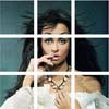
    Today we want to show you how to create some simple, yet stylish hover effects for image captions. The idea is to have a grid of figures and apply a hover effect to the items which will reveal a caption with the title, author and a link button. For some of the effects we will use 3D transforms. The aim is to keep the effects subtle and provide inspiration for many different variations.

    Universal Responsive Mega Menu with jQuery & CSS3

    Universal Responsive Mega Menu with jQuery & CSS3

    In this a author put together a flexible mega menu system that can hold 12 sizes of drop downs, unlimited fly-out elements combined with a jQuery script to enhance the whole system.It can be used as a sticky footer (with mega “drop-ups”) using the exact same markup as the “standard” mega menu. You can switch between those 2 variants just by changing a single class.

    Features:

    • Header and Footer Mega Menus
    • Fully Responsive Menu
    • Retina Ready Graphics
    • Flexible 12-Columns Grid
    • Styled Typography and Elements
    • Simple Working Contact Form
    • Clean and Professional Design
    • Touch-Screen Devices Friendly
    • Cross-Browser Support

    Blades 3D : CSS3 Responsive & Retina Ready Banner Rotator

    Blades 3D : CSS3 Responsive & Retina Ready Banner Rotator

    Blades 3D is a responsive and retina ready with CSS3 3D Transforms and CSS3 Transitions.

    Features:

    • Responsive (optional)
    • Retina Ready (optional)
    • Choose to use autoplay and set autoplay delay
    • Automatically randomize the slide order
    • Choose to turn off 3D flip beaviour and switch to “classic” mode
    • Choose from one of 6 different flip rotations or cycle through them all
    • Set “break-apart” thumb spacing
    • Set the number of grid columns and rows
    • Touch-swipe for mobile devices
    • Use as many slogans that will fit
    • Slogans support multiple lines and hyperlinks
    • Use more than one banner on the same page
    • jQuery free (no worrying about jQuery conflicts or having to update to the latest jQuery)
    • Custom settings can be passed through either JavaScript or HTML attributes.

    PathFinding.js : A comprehensive path-finding library in javascript

    PathFinding.js : A comprehensive path-finding library in javascript

    A comprehensive path-finding library for grid based games.The aim of this project is to provide a path-finding library that can be easily incorporated into web games. It may run on Node.js or the browser.

    Smooth Diagonal Fade Gallery with CSS3 Transitions & jQuery

    Smooth Diagonal Fade Gallery with CSS3 Transitions & jQuery

    In this tutorial we are going to create a gallery with a smooth diagonal fade effect, powered by css3 transitions. It will scan a folder with photos on the server and display them in a grid that spans the entire browser window. Adding new photos is as easy as copying two files (a regular image and a thumbnail, preferably 150×150 px) to the gallery folder.

    CSS3 capable browsers will show a smoothly animated diagonal fade effect, while older browsers will fall back to a simpler but still perfectly usable non-animated version of the gallery.