Best jQuery Grid Plugins & Tutorials with Demo

    jQuery Final Tiles Gallery

    jQuery Final Tiles Gallery

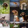
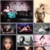
    FINALLY the best gallery for tiled layouts because it doesn’t crop your images while it still offers a complex layout, it’s not the same old boring layout made of columns or rows of same size.

    Best results are achieved using images of different sizes. Using images of same size will simply give you a standard grid layout.

    Horizontal Slide Out Menu with CSS3 & JavaScript

    Horizontal Slide Out Menu with CSS3 & JavaScript

    A horizontal slide out menu with a grid-like thumbnail layout for the submenu. With media query examples for smaller devices. The menu slides out from the top when a main menu item is clicked and the sub-items fade in. When clicking on another item, the height of the submenu will adjust and the content will fade in and out while switching.

    Some media query examples show how to make the menu responsive and change the view to a touch-friendly vertically stacked navigation.

    CSS3 Product Grid Layout with JavaScript

    CSS3 Product Grid Layout with JavaScript

    A responsive product grid layout that comes with some UI details for inspiration. The product will rotate showing the backside of the item when the rotate button is clicked. Some examples of how tooltips can appear on hover or click are also included. Media queries can be used to resize the items in the grid or change the number of items in a row. Flexbox is used when supported.

    jQuery Mosaic Flow : Pinterest like Responsive Image

    jQuery Mosaic Flow : Pinterest like Responsive Image

    Pinterest like responsive image grid for jQuery that doesn’t suck.

    Features:

    • Simple and easy to install.
    • Responsive (shows as many columns as needed).
    • Very fast.
    • Only 1 KB (minified gzipped).
    • You can add some HTML: info overlay for example.

    jQuery Photoset Grid

    jQuery Photoset Grid

    A simple jQuery plugin to arrange images into a flexible grid, based on Tumblr’s photoset feature. Originally the plugin was created for our Style Hatch Tumblr themes as a way to use the photoset grid in responsive layouts, but we have since expanded it for use outside of the themes.

    jQuery CSS3 App Showcase with Grid Overlay

    jQuery CSS3 App Showcase with Grid Overlay

    Today we will be creating a little app showcase with a neat effect in jQuery and CSS3. The idea is to show a mobile device with a screenshot of an app and when clicking on the device, a grid appears, showing some more screenshots. The effect is very subtle: the device moves back and the grid fades in and scales up. When clicking on another screenshot, the device image gets updated and the grid disappears again.

    Thumbnail Grid with Expanding Preview in jQuery & CSS

    Thumbnail Grid with Expanding Preview in jQuery & CSS

    A tutorial on how to create a thumbnail grid with an expanding image preview similar to the effect seen on Google Images.If you have searched images on Google recently, you might have noticed the interesting expanding preview for a larger image when you click on a thumbnail. It’s a really nice effect and it is very practical, making a search much easier. Today we want to show you how to create a similar effect on a thumbnail grid. The idea is to open a preview when clicking on a thumbnail and to show a larger image and some other content like a title, a description and a link.

    The interesting part is to calculate the correct preview height and to scroll the page to the right position. We’ll expand the preview in a way so that we can see the respective thumbnail row and cover the rest of the remaining page. Note that we don’t use very large images for the preview in the demo so you might see a lot of empty space on large monitors.

    Unlimited Grid Layout in CSS & JavaScript

    Unlimited Grid Layout in CSS & JavaScript

    During my work as a frontend developer I coded many sites with a full page layout, both before and after the Flash decline.

    Coding this type of layout was, every time, one step forward towards a better and more maintainable CSS structure; however, even if every single length was expressed as a relative and flexible unit, we need to know the number of pages.

    For example: if we have an horizontal structure of 6 pages we set the pages’ container width to 600% and every single child page width to 16.66%. But if the number of pages changed to 5 or 7 we have to edit the CSS.

    Responsive Gridfolio : JavaScript Html5 Responsive Layout

    Responsive Gridfolio : JavaScript Html5 Responsive Layout

    The Responsive Gridfolio has a fluid / flexible / responsive layout. Basically the grid is added into a html page into a div of your chosing and it’s adapting based of that div’s width, the grid height is modified based on the thumbnails and if other elements are below the grid div they will be pushed down automatically (document flow).

    The Responsive Gridfolio is using the GPU (hardware acceleration) using HTML5 standards. The rendering speed and performance is impeccable on desktop computers and most importantly on mobile devices, the way it works it will try to use CSS3 and if this is not available it will down fall to CSS2 or CSS1 for older browsers like IE7 and IE8.

    Nested : jQuery Gap free, Multi column Grid layout Plugin

    Nested : jQuery Gap free, Multi column Grid layout Plugin

    Nested is a jQuery plugin which allows you to create multi-column, dynamic grid layouts. Unlike other libraries and jQuery plugins similar to Nested, this is (as far I as I’ve know) the first script out there that allows you a complete gap-free layout.

    It creates a matrix of all elements and creates a multi column grid, similar to other libraries and scripts out there. Then it scans the maxtric for gaps and tries to fill them by reordering the elements. This is exactly how I’ve seen other newer libraries, scripts and modifications behave but if you stop here, the result will sometime leave unwanted gaps as well. That is why I added the last step, an option to resize any element at the bottom of the grid that is bigger (or smaller if you prefer) than the gap to make the grid completely gap-free.